So, you’ve just applied a brand new theme to your blog, freshly downloaded from the Internet. But does the colour of your blog represent your topic well? You might say that colour is the least of your worries – after all, content is king, right? That may be correct, but it’s certainly worth taking a bit of time deciding on a colour scheme that compliments your writing style and topic niche.
By using colour, it is possible to change a reader’s mood or get them in a particular state of mind for the content they are about to view. For example, the colour pink may well be your favourite, but is not necessarily the correct colour for your site’s background if you’re writing about football. In fact, pink would be the perfect colour to repel any male readers from your blog. That’s all well and good if you want to exclude them, but it may not be a good idea to risk alienating potential reader base.
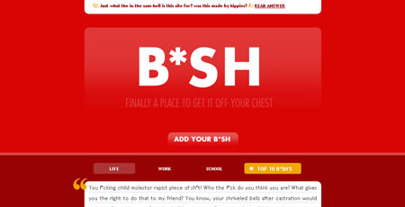
Red indicates danger, warning and anger. It implies that the information contained on your site is important and must-read material. Be careful not to overuse red, as it can quickly become overpowering. When combined with black, shades of grey and white, however, it can effectively replicate the atmosphere of a tabloid newspaper. Dark reds can also have a sombre, dignified quality.
For an aggressive, striking page, consider adding elements of orange. Its ‘in your face’ quality makes it ideal for playful, cheerful designs with an added edge.

Yellow can be as dominant or as recessive as the designer so chooses, with the lighter shades giving a warm, summery feel. When combined with red, yellow can indicate extreme danger or highlight very important points.
A predominantly green website indicates an association or affinity with nature and natural things, making this colour the ideal choice for gardening or botany websites. Compliment with shades of brown for an extra ecological element. Slightly washed out shades of green introduce a sedate, harmonious feel that will make the user feel comfortable before they have even read a thing.
Melancholy blues can impose a sense of professionalism, of seriousness on the reader. Blue recedes – that is, it quickly drops to the background – making it ideal to fill large areas of colour and to emphasise certain, vital points.
Black text is plain, regular and no-nonsense but this is, in most cases, a good thing. It is a clear and impactive colour, and when combined with white can be incredibly forceful if used in the right way.
For a clean, pure, sterile outlook, select white. The complete absence of colour means the user has nothing to do but read the information provided – there are no threatening obstacles or preconceptions in the reader’s mind. Use wisely, however, as this web-default colour can come across as boring and unimaginative.


If there was ever a good beginner’s guide to the use of color in website design and blogging, this is it! Great
After reading the article, I feel that I need more information on the topic. Can you suggest some more resources please?